Summary of Project
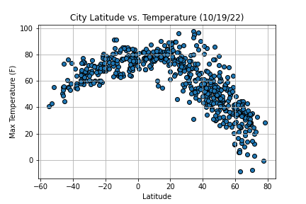
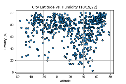
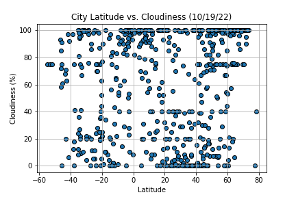
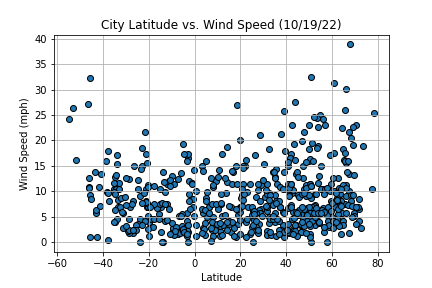
The goal of this project was to determine how weather is affected as we approach the equator. A python script was created to generate a list of at least 500 different cities of various latitudes. Then, using the OpenWeatherMap API, weather data was retrieved from each city in order to create scatter plots to visualize the relationship of a city's latitude on four different factors: maximum temperature, humidity, cloudiness, and wind speed.
This website provides each of the scatter plots created in MatPlotLib along with an explanation of its significance, a page containing each visualization allowing for a clear comparison, and a responsive table containing the data used for this project.


